Revamping RedBus.com Search Result Page for International Backpackers


Slide the handle bar to see the old and new design.
🔒Note: “Sensitive information around this case study has been obfuscated for confidentiality reasons.
👉Overview
The search result page on RedBus.com was created using a redBus.in standard template that did not cater to the specific needs of the website. This resulted in several usability issues that negatively impacted the conversion rate. This case study outlines how I addressed the usability issues to improve the search result page and increase the conversion rate by adding new features.
👨💻My Responsibility
As the UX designer, I collaborated closely with a product manager from RedBus Dot Com (RDC) to create the Product Requirement Document (PRD), conduct an UX Design Audit, perform Competitive Analysis, develop Wire framing, and complete Design Validation.
🚀Design Approach

Design Challenge 1
1.Solving existing Usability Issues to reduce the drop off rate.
I conducted an UX audit to identify pain points and areas for improvement in the current search result page. This allowed me to understand user needs and preferences. The following are some of the usability issues that were identified on the RedBus.com search result page:

Design Challenge 2
2. Implement the following new features and enhancements on RedBus.com's SRP to improve user experience and conversion rates:
💥 Cheapest and Fastest tags: Introduce tags for the cheapest and fastest options on international routes, enabling travelers to easily identify and select the best options based on their preferences.
💥 COVID Restrictions Placeholder: Implement a placeholder that displays the COVID restrictions for specific countries, based on the user's selected source and destination. This will keep travelers informed about the current travel guidelines.
💥 Transfers Callout: Clearly call out bus transfers on search results for services in Europe and other countries that require travelers to change buses during their journey. This ensures users understand the full travel itinerary.
💥 E-Ticket/M-Ticket Callout: Highlight the availability of E-Ticket or M-Ticket options when supported by bus operators in specific geographies, providing users with valuable information about ticketing options.
💥 RedBus Trust Markers Section: Include a dedicated section to showcase redBus trust markers, similar to the data displayed on the home page. This will help to build credibility and trust among users.
✏️Wire framing:
I created wireframes that incorporated improved search functionalities, filters, and user-friendly layouts to cater all the new features.Then I got it reviewed with my Design Manager.
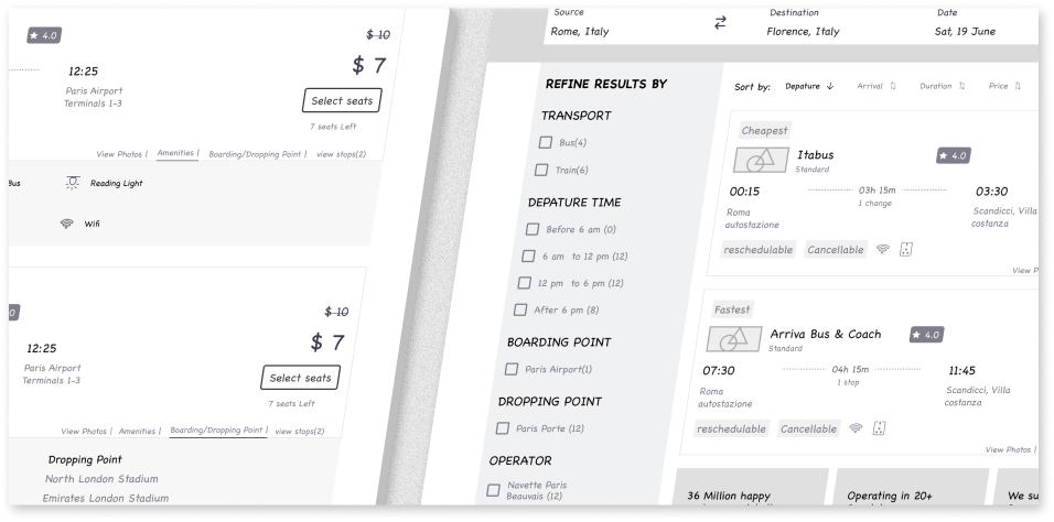
1.Revamped Search Result Page

💥 Logos: Ensuring that logos are not distorted or compressed, and given enough space and width for easy recognition.
💥 Operator name: Placing the logo and operator name together to help users establish a connection and recall.
💥 Transport mode: Adding a provision to display the transport mode for better user understanding.
💥 Time: Making the time the first data point users see, placed on the extreme left for easy access.
💥 Boarding and Drop-off points: Highlighting BP and DP points for user convenience.
💥 Ratings and Seat design: Ensuring the layout is not awkward, even without ratings and seat design.
💥 Amenities: Focusing on amenities that matter most to our user persona, such as charging points, wi-fi, extra leg space, inclined seats, and cleanliness.
2. Incorporating New 🆕 Features on SRP

💥 Cheapest and Fastest tags: Introduce tags for the cheapest and fastest options on international routes, enabling travelers to easily identify and select the best options based on their preferences.
💥 COVID Restrictions Placeholder: Implement a placeholder that displays the COVID restrictions for specific countries, based on the user's selected source and destination. This will keep travelers informed about the current travel guidelines.
💥 Transfers Callout: Clearly call out bus transfers on search results for services in Europe and other countries that require travelers to change buses during their journey. This ensures users understand the full travel itinerary.
💥 E-Ticket/M-Ticket Callout: Highlight the availability of E-Ticket or M-Ticket options when supported by bus operators in specific geographies, providing users with valuable information about ticketing options.
💥 RedBus Trust Markers Section: Include a dedicated section to showcase redBus trust markers, similar to the data displayed on the home page. This will help to build credibility and trust among users.
3. SRP Tuple design for Train🚆

💸Success Metrics
⬆️25% increase in user engagement: The revamped search result page led to higher user interaction and engagement with the platform.
⬇️18% decrease in bounce rate: Improved usability and design contributed to a lower bounce rate, indicating a better user experience.
❤️Conclusion
Thank you for taking the time to read through this case study. While this case study provides only a glimpse of my work at redBus, I hope it demonstrates my design process and approach to problem-solving.
Although I did not cover the Complete modules in this case study, I would be happy to discuss it further in a call. Please feel free to reach out if you have any questions.
Visit redbus.com for live preview